Mastering Frontend Project Structures: Choosing the Right Folder Architecture
A comprehensive developer's guide to frontend project organization—exploring Flat, Type-Based, Feature-Driven, Atomic, and Domain-Driven structures for scalable React & Next.js applications.

One of the earliest architectural choices you make when building a frontend project is deciding how to organize your files and folders.
There is no single "golden template" or universal structure that fits every single application. The ideal file architecture depends entirely on your project's scope, the complexity of your application state, and the size of your team. A personal portfolio or landing page doesn't require the multi-layered modular architecture of an enterprise SaaS platform.
In this guide, we will unpack the 5 most popular frontend folder structures, examine their strengths and trade-offs, and establish a decision framework to help you pick the right pattern for your next project.
1. The Flat Structure
The Flat Structure is the simplest way to organize a project. All source code is kept near the root of the src directory with minimal nesting.
src/
├── 📁 components/
├── 📄 pages/
├── 🖼️ assets/
├── ⚛️ App.tsx
└── 🚀 main.tsx
Ideal For
- Quick prototypes and proof-of-concepts
- Beginners learning React or frontend fundamentals
- Personal portfolio websites and single-page landing pages
Advantages
- Minimal Friction: Zero cognitive load when creating new files or importing modules.
- Low Boilerplate: Eliminates deep directory trees and complex relative imports.
- Fast Setup: Gets your application up and running within minutes.
Disadvantages
- Scalability Bottlenecks: As the component count grows into the dozens, the
componentsfolder becomes overcrowded and chaotic. - Tight Coupling: Without clear sub-domain boundaries, components often end up tightly coupled to specific pages.
2. The Type-Based (Technical Role) Structure
In a Type-Based Structure, files are categorized by their technical role—such as hooks, components, state management contexts, utilities, and services.
src/
├── 🌐 api/
├── 🖼️ assets/
├── 🧩 components/
│   ├── 📐 layout/
│   └── 🎨 ui/
├── ⚡ context/
├── 💾 data/
├── 🪝 hooks/
├── 📄 pages/
├── 🔄 redux/
├── ⚙️ services/
├── 🛠️ utils/
├── ⚛️ App.tsx
└── 🚀 main.tsx
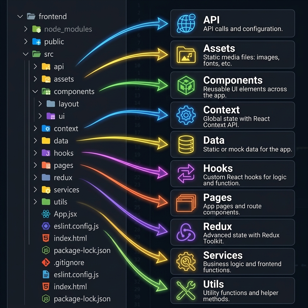
Here is a visual map of how a typical Type-Based workspace breaks down key responsibilities:
Key Folder Breakdown
api/&services/: Encapsulates network requests, Axios/Fetch instances, and external service client configuration.components/: Houses reusable UI elements (e.g. layout wrappers, buttons, modals).context/&redux/: Manages global application state through React Context or Redux Toolkit stores.hooks/: Custom React hooks encapsulating reusable stateful behavior.pages/: Top-level page views and route controllers.utils/&data/: Pure utility helper functions, formatting tools, and static mock data.
Ideal For
- Small to medium React applications
- Teams building focused production apps with straightforward business logic
Advantages
- Predictable Navigation: Easy to locate all hooks, services, or types in dedicated directories.
- Industry Standard: Highly familiar to React developers and common across tutorial ecosystems.
Disadvantages
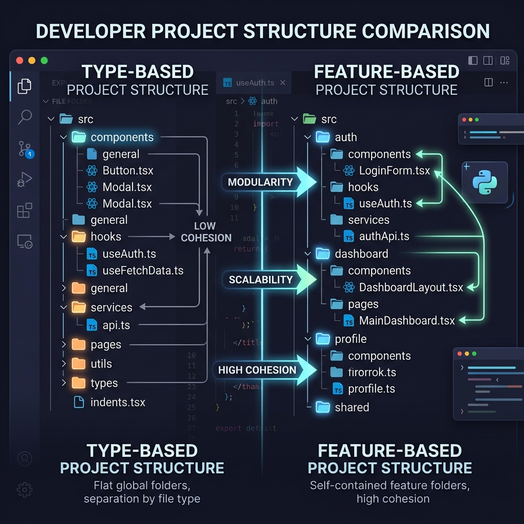
- File Dispersion: Working on a single feature (e.g. user authentication) requires jumping between
components/,hooks/,services/, andtypes/. - Context Switching: High file switcher overhead during active feature development.
3. The Feature-Based (Vertical Slice) Structure
The Feature-Based Structure groups files by business functionality rather than technical file type. Each feature acts as an isolated mini-module containing its own UI, state, hooks, and API handlers.
src/
├── 📦 features/
│   ├── 🔐 auth/
│   │   ├── 🌐 api/
│   │   ├── 🧩 components/
│   │   ├── 🪝 hooks/
│   │   ├── 📄 pages/
│   │   ├── 🏷️ types/
│   │   └── 📌 index.ts
│   ├── 📊 dashboard/
│   ├── 👤 profile/
│   └── 🛍️ products/
├── 🤝 shared/
│   ├── 🧩 components/
│   └── 🛠️ utils/
├── 📐 layouts/
├── 🗺️ routes/
└── ⚛️ App.tsx
Ideal For
- Production-grade React and Next.js applications
- SaaS products, enterprise dashboards, and multi-developer teams
Advantages
- High Cohesion: Everything related to a feature lives in one place, minimizing context switching.
- Seamless Scalability: Adding or removing a feature is as simple as creating or deleting a single directory.
- Improved Team Collaboration: Different developers can work on separate feature directories without git merge conflicts.
Disadvantages
- Slight Upfront Overhead: Requires upfront planning to decide what constitutes a feature versus a shared utility.
- Potential Code Duplication: If shared logic is not extracted into
shared/, duplicate helpers can emerge.
4. The Atomic Design Structure
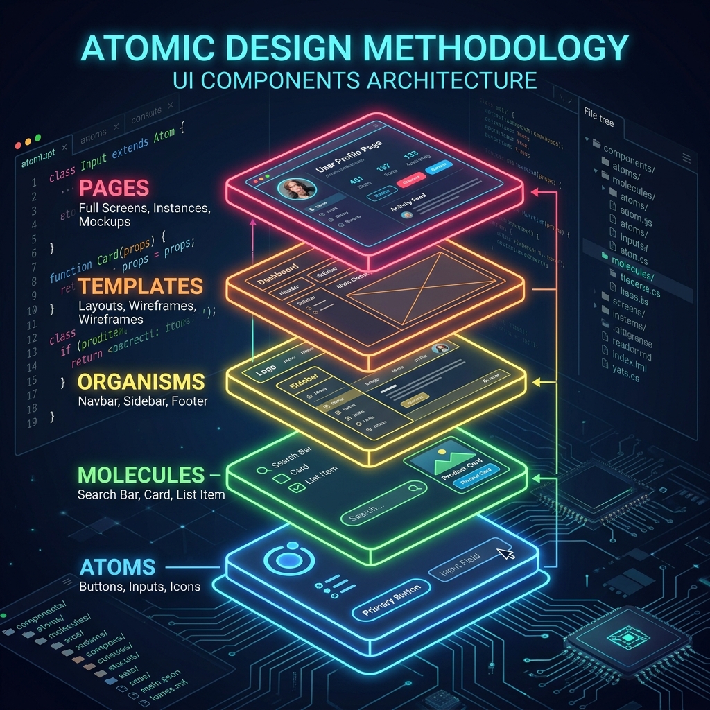
Derived from Brad Frost's Atomic Design methodology, this structure breaks down user interfaces into five distinct hierarchical levels: Atoms, Molecules, Organisms, Templates, and Pages.
src/
├── 🧩 components/
│   ├── ⚛️ atoms/
│   │   ├── 🔘 Button.tsx
│   │   └── 📝 Input.tsx
│   ├── 🧪 molecules/
│   │   ├── 🔍 SearchBar.tsx
│   │   └── 🃏 ProductCard.tsx
│   ├── 🦠 organisms/
│   │   ├── 📑 Navbar.tsx
│   │   └── 🗂️ Sidebar.tsx
│   ├── 📐 templates/
│   │   └── 🖼️ DashboardLayout.tsx
│   └── 📄 pages/
│       └── 🖥️ DashboardPage.tsx
Component Hierarchy Explained
- Atoms: Fundamental building blocks (Buttons, Inputs, Icons, Badges).
- Molecules: Small combinations of atoms functioning as a unit (SearchBar = Input + Button).
- Organisms: Complex UI sections combining molecules and atoms (Header, Navigation Bar, Sidebar).
- Templates: Layout skeletons mapping component placements without actual content.
- Pages: Specific screen instances populated with real data and state.
Ideal For
- Dedicated UI component libraries and design systems
- Design-system-driven engineering teams using Storybook
Advantages
- Maximum Component Reusability: Promotes modular, decoupled UI components.
- Design System Alignment: Directly mirrors UI/UX design tokens and Figma component hierarchies.
Disadvantages
- Over-Engineering Risk: Categorizing borderline components (is it a molecule or an organism?) can lead to bikeshedding.
- Steep Learning Curve: Can feel unnecessarily rigid for standard web applications.
5. The Domain-Driven Structure
For large-scale applications with distinct business domains, Domain-Driven Design (DDD) organizes code around business boundaries rather than technical layers.
src/
├── 🏛️ modules/
│   ├── 👥 users/
│   ├── 📦 orders/
│   ├── 💳 billing/
│   └── 📈 analytics/
├── ⚙️ core/
│   ├── 🌐 http/
│   └── 🔄 store/
└── 🚀 main.tsx
Ideal For
- Large enterprise applications and complex SaaS platforms
- Micro-frontend architectures and multi-team codebases
Advantages
- Domain Isolation: Keeps business domains decoupled and independently maintainable.
- Future-Proofing: Simplifies migrating individual domains into micro-frontends or separate packages later.
Disadvantages
- Overkill for Small Apps: Adds unnecessary abstraction for applications without complex business logic.
Quick Reference: Choosing the Right Structure
| Project Type | Recommended Architecture | Primary Reason |
|---|---|---|
| Portfolio / Landing Page | Flat Structure | Zero setup overhead and minimal file complexity. |
| Small-to-Medium Web App | Type-Based Structure | Intuitive organization for standard React apps. |
| Production SaaS / Dashboard | Feature-Based Structure | High cohesion, modularity, and smooth scaling. |
| Design System / Component Library | Atomic Design | Strict UI hierarchy and maximum reusability. |
| Enterprise Multi-Domain App | Domain-Driven Structure | Decouples business logic across enterprise teams. |
Summary & Best Practices
If you're unsure where to begin:
- Start with what matches your current complexity. For 80% of production web applications, a Feature-Based Structure provides the best balance of scalability, readability, and maintainability.
- Don't over-engineer early. You can always transition from a Type-Based or Flat structure into Feature-Based modules as your application grows.
- Keep shared logic clean. Always maintain a clear
shared/orcommon/directory for true cross-cutting utilities and UI primitives.
By selecting an architecture aligned with your project's goals, you set up your codebase—and your team—for long-term success.